OVERVIEW
Project Name: EZ (Easy)
Platform: Mobile E-Commerce App
My Role: UX Designer (solo project)
Duration: 3 weeks
Tools Used: Figma(Design & FigJam) | Google Forms | Google Docs | Excel(Gantt Chart)
Type: Concept project based on real user research
I designed a foreigner-friendly mobile shopping experience in Japan, tailored to English-speaking users who face cultural, procedural, and language-related barriers. This project was created using UX principles from the Google UX Design Certificate program.

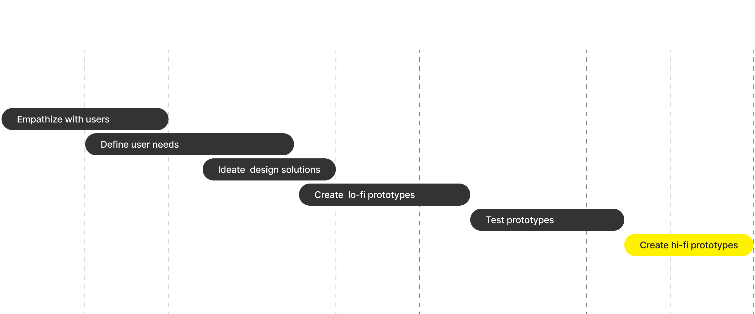
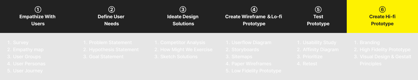
TIMELINE
THE CHALLENGE
How might we design an e-commerce experience that feels simple, accessible, and trustworthy for foreigners living in Japan—especially those who face:
Language barriers
Overwhelming information presentation
Frustration from unfamiliar local procedures
Lack of of confidence & trust
Most Japanese e-commerce platforms (like Rakuten or Mercari) are not optimized for foreign users. These platforms often overwhelm users with cluttered UIs, lack language support, and reflect design patterns unfamiliar to non-Japanese residents.
MY ROLE

Planned and conducted user research (surveys & insights synthesis)
Designed UX flows, wireframes, and UI mockups
Conducted iterative testing and applied improvements
Synthesized findings into a cohesive digital experience
This was a solo project based on real user needs, created for my UX certification and portfolio.
THE PROCESS
GOALS & SUCCESS METRICS
User Goals:
Shop online in English with clarity and ease
Navigate intuitive and familiar UI flows
Feel reassured by transparent processes and design
Business Goals:
Improve user retention and engagement among foreign nationals
Increase conversion rates and repeat purchases
Build brand trust with an underserved demographic
Metrics:
Task success rate in usability testing
Reported ease of use
Self-reported trust and satisfaction ratings
Research & Discovery
I conducted open surveys using Google Forms, shared across two expat Facebook groups:
“Foreigners Living in Japan”
“For Foreigners Living in Japan”
Methodology:
17 multiple-choice questions (quantitative)
5 short/long-answer questions (qualitative)
8 participants (English-speaking residents currently or previously Japan)
Key Findings:
Millennials (≈ 62.5%) and Generation Y(≈ 38%)
87.5% currently live in Japan (12.5% of users have lived in Japan)
62.5% face regular language barriers while shopping online & are mobile users
62.5% are frustrated with poor product descriptions (37.5% difficult navigation)
75% trust product reviews but still need verification from other sources
Personalized recommendations were equally helpful & Intrusive.
Users described Japanese sites as “cluttered,” “confusing,” and “unwelcoming”
Many were frustrated by the lack of multilingual support, complex checkout processes, and too much dense information
FACEBOOK GROUP FINDING
“During early user research, I discovered that certain terms like “Expat” and “Immigrant” triggered strong emotional responses among participants. Some users, particularly non-Caucasian individuals, perceived these labels as biased or exclusionary— resulting in a heated debate within the original research thread.” 😓
“To foster inclusivity and avoid misunderstandings, I adopted more neutral, widely accepted terminology such as “Foreigner” and “Foreign Nationals” throughout the research process. This ensured a respectful, culturally sensitive environment and encouraged more honest and constructive feedback from a diverse audience.”
EMPATHY MAP (AGGREGATE)
click / tap to expand
PROBLEM DEFINITION
Foreigners in Japan struggle with e-commerce platforms that are not built with them in mind—leading to frustration, cart abandonment, and distrust.
Key Pain Points:
Overwhelming UI with too many options
Lack of visual hierarchy or Western-style flows
Difficult account setup and checkout steps
Distrust in unclear delivery/payment/subscription terms

IDEATION & UX STRATEGY
Based on user pain points, I created:
User flows that reflect common Western e-commerce journeys (search → product → add to cart → checkout)
Simplified checkout process with clearer visuals, bilingual toggles, and step indicators
Persona development to understand long-term vs. short-term resident needs
The design strategy focused on clarity, familiarity, and cross-cultural accessibility—while keeping it feeling modern with a good use of whitespace.
Developed “How Might We” questions targeting Key painpoints like one-handed mobile search, trust signals, simplified product info, low-pressure subscription model.
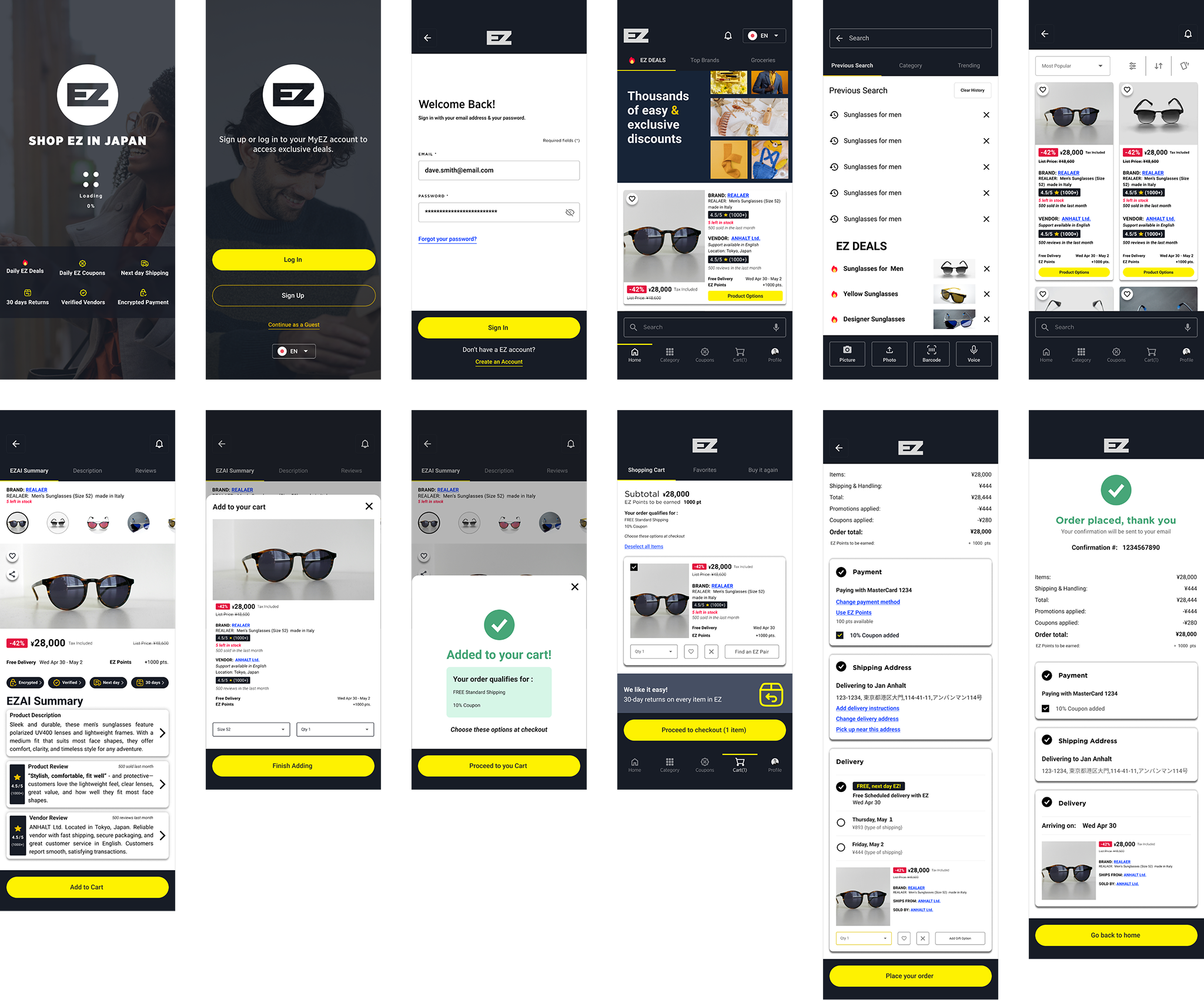
USER FLOW OF EZ PLATFORM
Wireframes
-
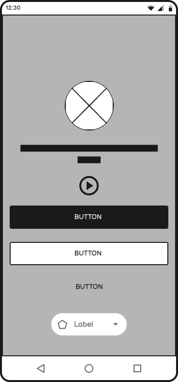
![loading screen]()
Loading Screen
-
![login & signup Screen]()
Login Screen
-
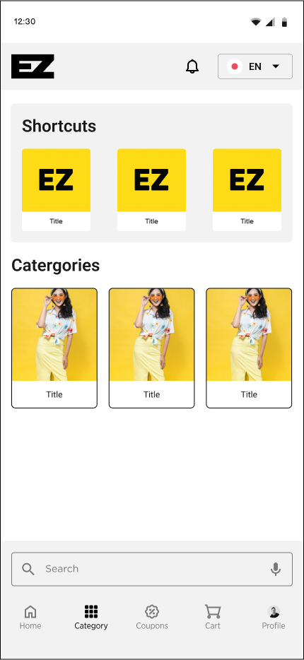
![home screen]()
Home Screen
-
![search screen]()
Search Screen / Modal
-
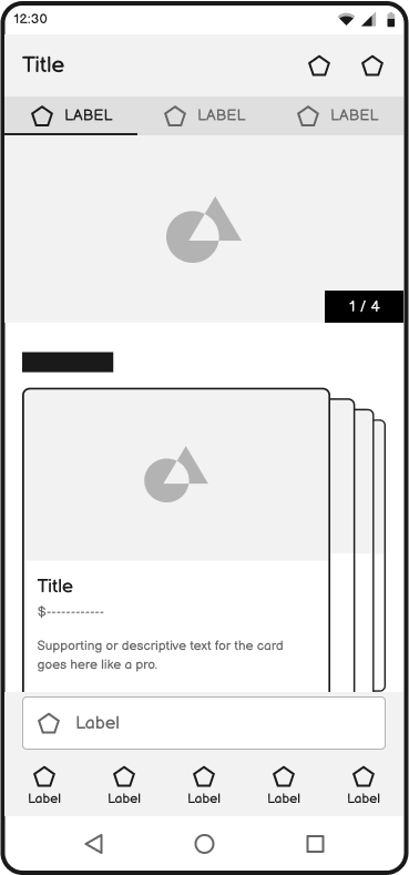
![listing screen]()
Listing Screen
-
![product description screen]()
Product Description Screen
-
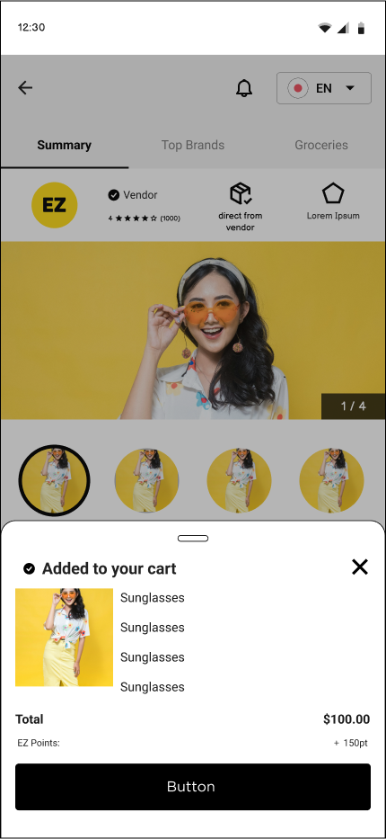
![added to shopping cart modal]()
Confirmation Modal
-
![category screen]()
Category Screen
-
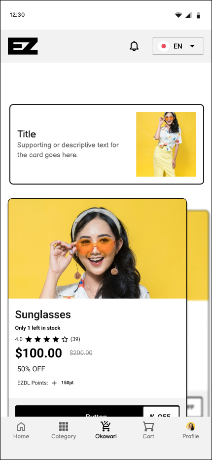
![okawari]()
Okawari (refill)
-
![product refill description screen]()
product refill description screen
-
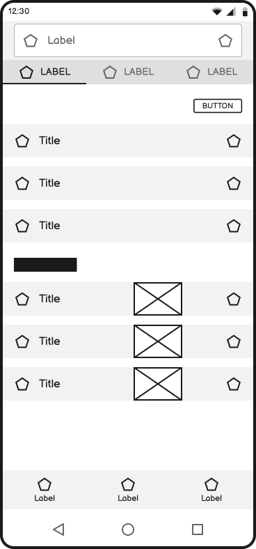
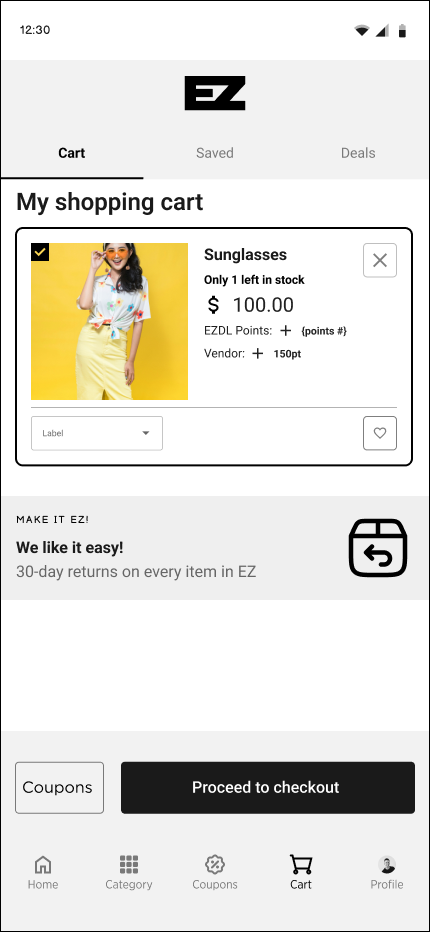
![shopping cart screen]()
Shopping Cart Screen
-
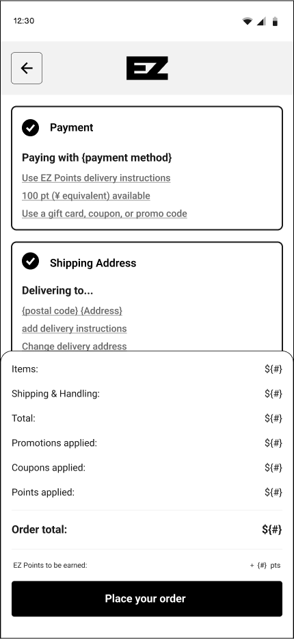
![checkout screen]()
Check Out Screen
-
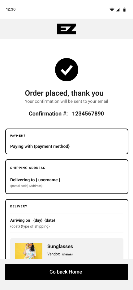
![confirmarion screen]()
Confirmation Screen


Low Fidelity
-
![loading screen]()
Loading Screen
-
![login & signup Screen]()
Login Screen
-
![home screen]()
Home Screen
-
![search screen]()
Search Screen / Modal
-
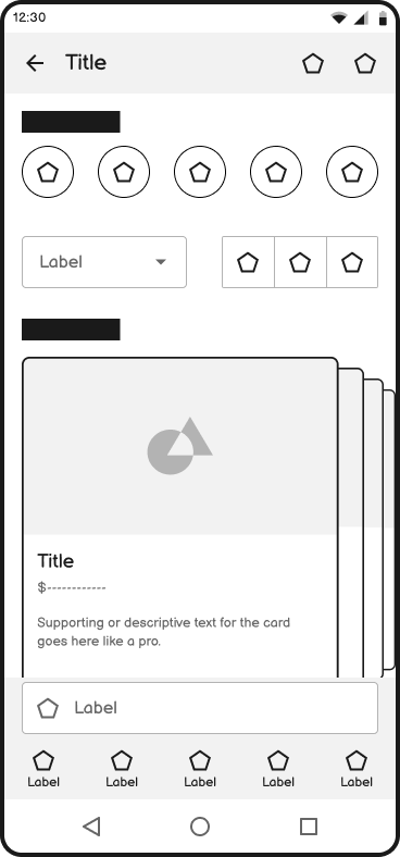
![listing screen]()
Listing Screen
-
![product description screen]()
Product Description Screen
-
![added to shopping cart modal]()
Added to Cart Modal
-
![category screen]()
Category Screen
-
![okawari]()
Okawari (refill)
-
![Okawari Description Screen]()
product refill description screen
-
![shopping cart screen]()
Shopping Cart Screen
-
![checkout screen]()
Check Out Screen
-
![confirmation screen]()
Confirmation Screen


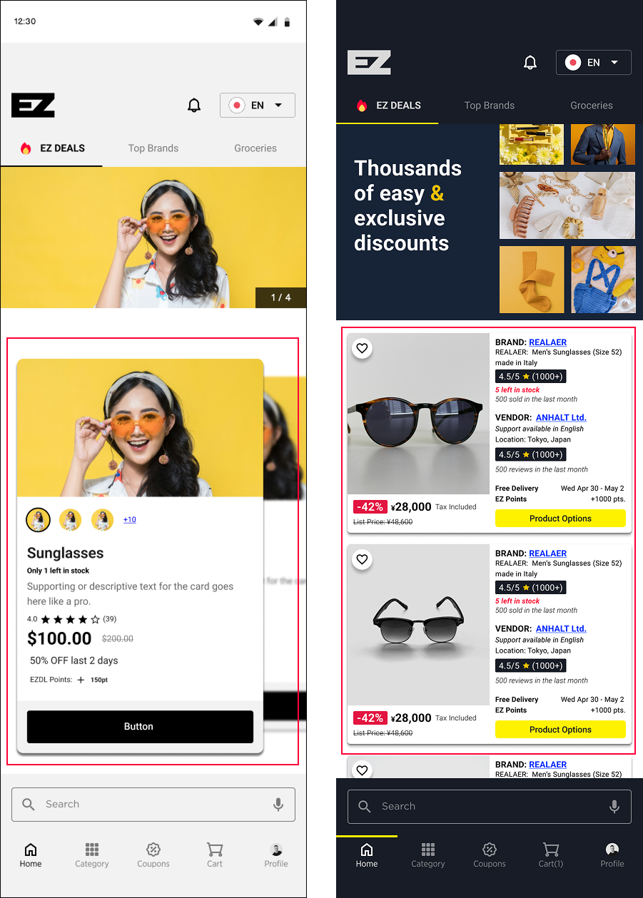
UI DESIGN & VISUAL DIRECTION
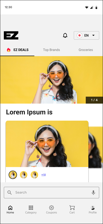
Clean layout with generous white space
Dark Appbar & Bottom nav to reduce brightness
Large, legible English and Japanese fonts
Bright yellow primary color for high contrast
Fixed bottom nav, Western cart flow
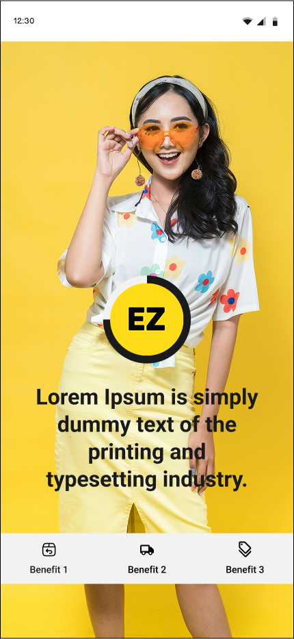
Friendly images to reduce anxiety
PROTOTYPING & USABILITY TESTING
Using Figma, I built a mid-to-high fidelity prototype and conducted informal usability testing with 5 English-speaking residents in Japan.
Key Results:
5/5 Participants completed the checkout task successfully
5/5 Reported the flow as “easy,” “clear,” and “more familiar than Rakuten”
3/5 Participants Appreciated bilingual toggle and icon use
5/5 Participants Fixed primary buttons, search bar, and menu at the bottom were convenient.
3/5 Participants said the swipeable item lists and swipeable tab categories interfered with each other.
4/5 Participants said the Cost breakdown took up too much space on the pull-down modal.
5/5 Participants could not find favorite (save) or share buttons.
4/5 Participants could not find vendor information in the product page
click or tap to expand
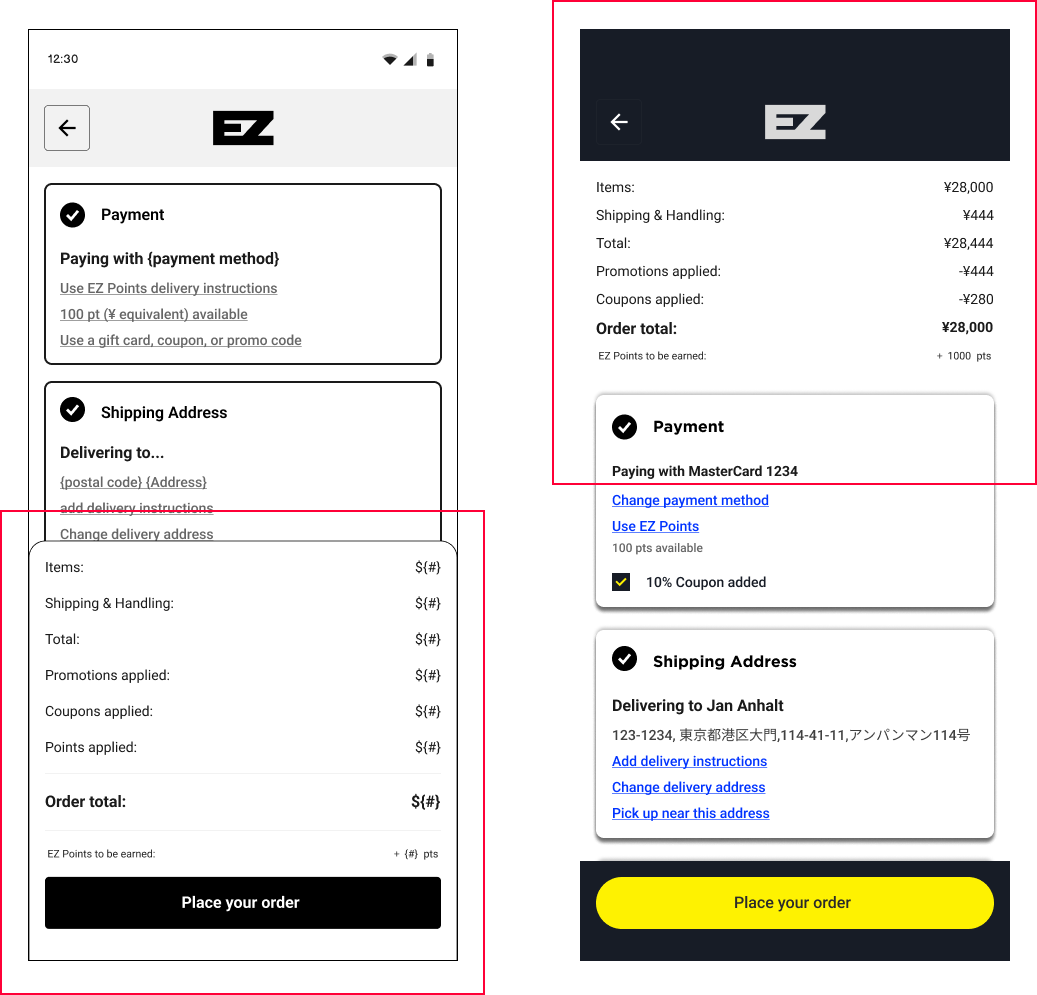
CHANGES MADE
-
![]()
Cost Breakdown Modal
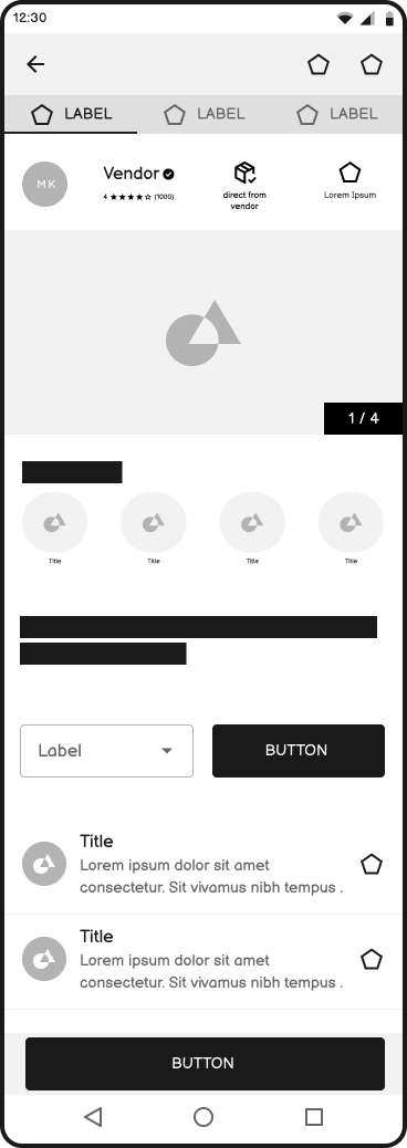
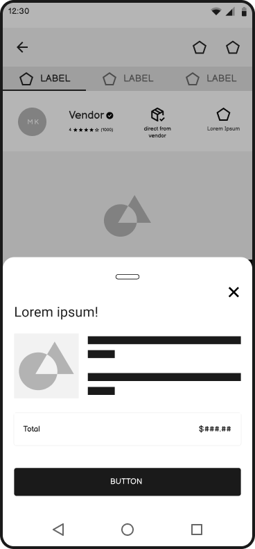
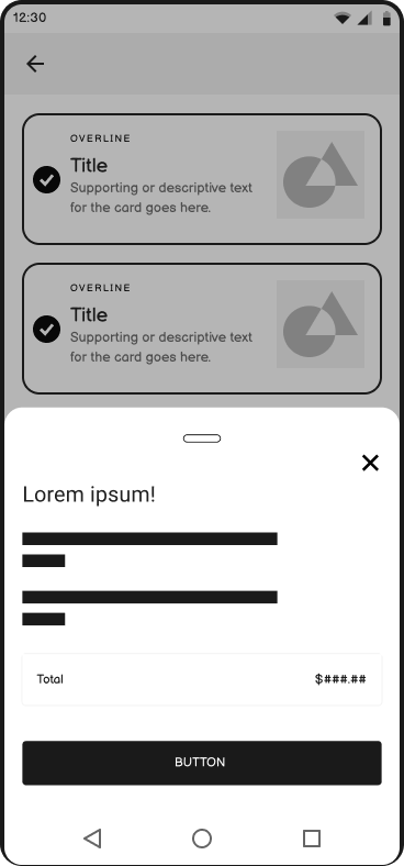
Based on usability testing feedback, I removed the cost breakdown modal due to its large footprint and instead integrated a streamlined version at the top of the page.
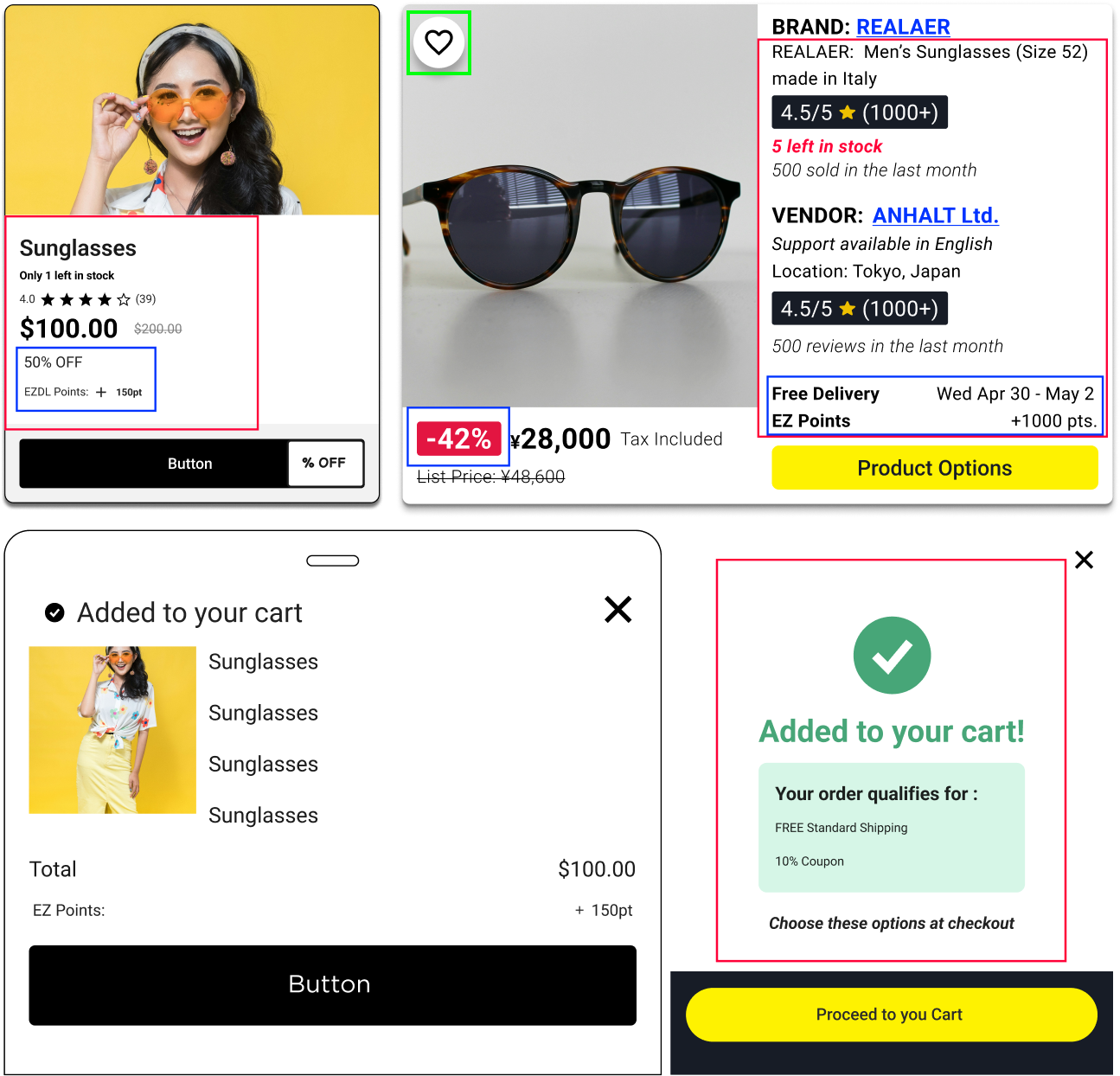
-
![]()
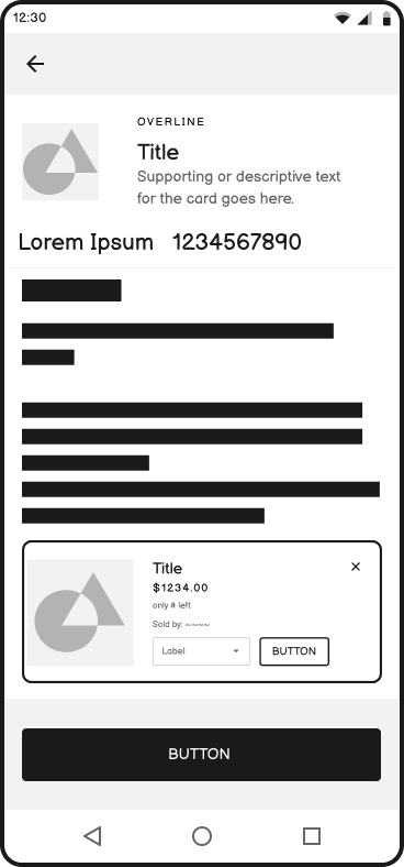
Trust/ benefits & Favorite button
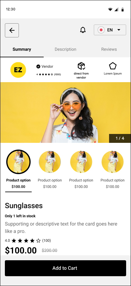
To improve user confidence and engagement, I highlighted trust indicators and benefits using high-contrast background elements and bold text. I also added a favorite button to the top-left corner of product images for easier saving.
-
![]()
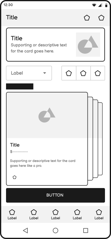
Language button & AI Summary
100% of test users reported that they didn’t need constant access to the language switcher and preferred it placed on the main page instead. Additionally, over half of users wanted to see vendor information but were unaware it was located in the swipeable tabs. Rather than redesigning the tabs, I redesigned the summary section to include an AI-powered overview that highlights key points from the product description, vendor reviews, and product reviews—making the most relevant information accessible at a glance.
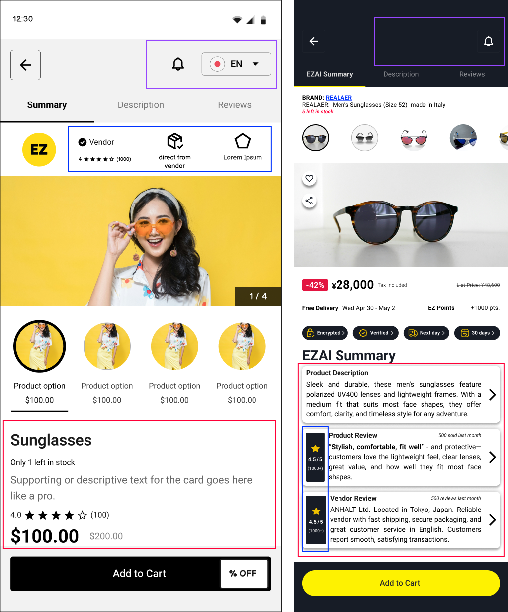
-
![]()
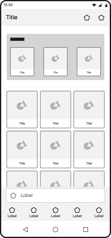
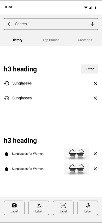
Swipeable list to a swipe down list
Usability testing showed that overlapping swipe gestures between the list and category tabs confused users. To streamline the interaction and stay within timeline constraints, I opted for a familiar swipe-down list format.
High Fidelity Prototype

Do Me a Favour!
“If you can, take a quick second to connect with me on LinkedIn —it would mean the world to me!

Other Projects
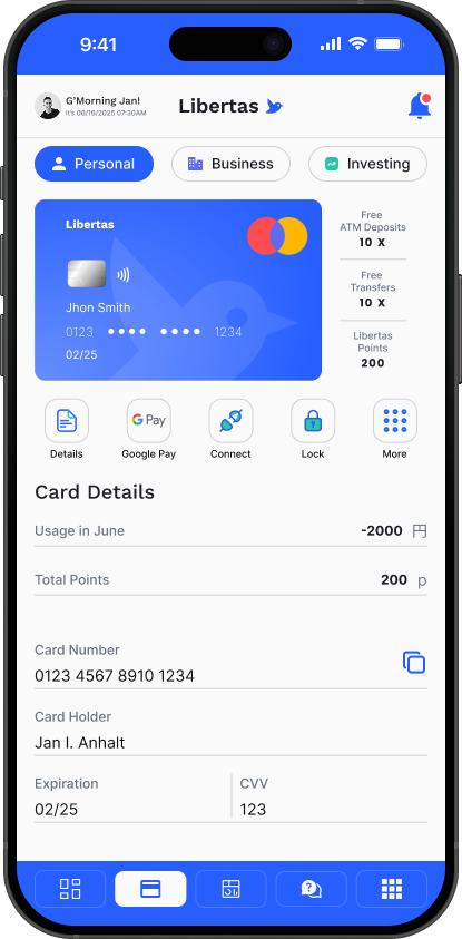
-
![]()
CS3 | Libertas
-
![]()
CS2 | My Mirai